Scroll
to Top


Scroll
to Top
Scroll
to Top
Case Study
Yale School of Art Redesign
Role
UI Design
Tools
Figma, Photoshop
Timeline
2 weeks
Year
2022


Brief
The Yale School of Art homepage had issues such as, bad layout, it was difficult to navigate and overall confusing to students in the program who want to get information
Ono Sushi, based in Las Vegas, specializes in high-quality Japanese cuisine
with a focus on fresh seafood. The restaurant aims to create a fun and welcoming atmosphere where guests can enjoy delicious food with friends
and family. The brand's values emphasize a sense of community, freshness,
and a home-like environment.
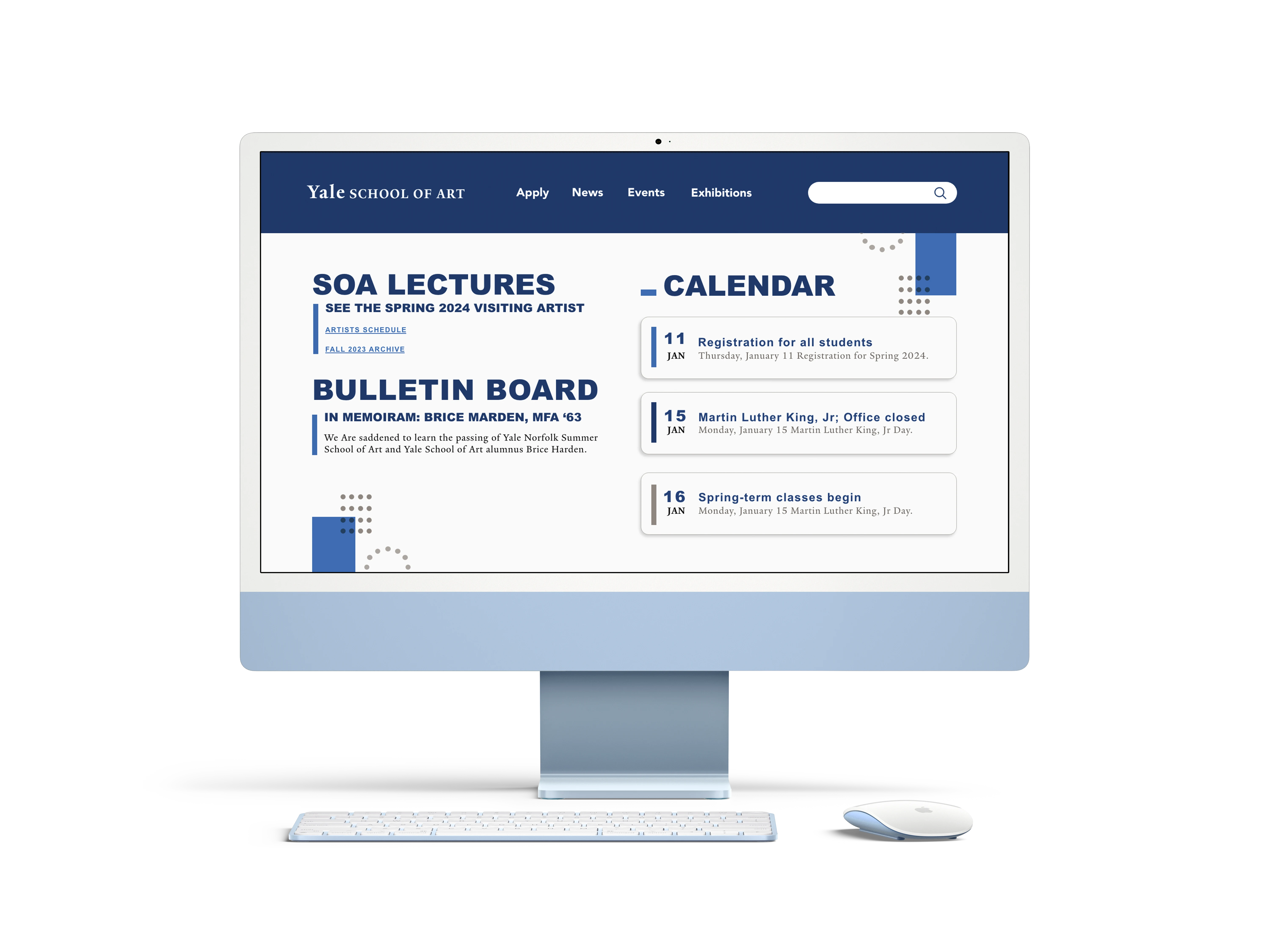
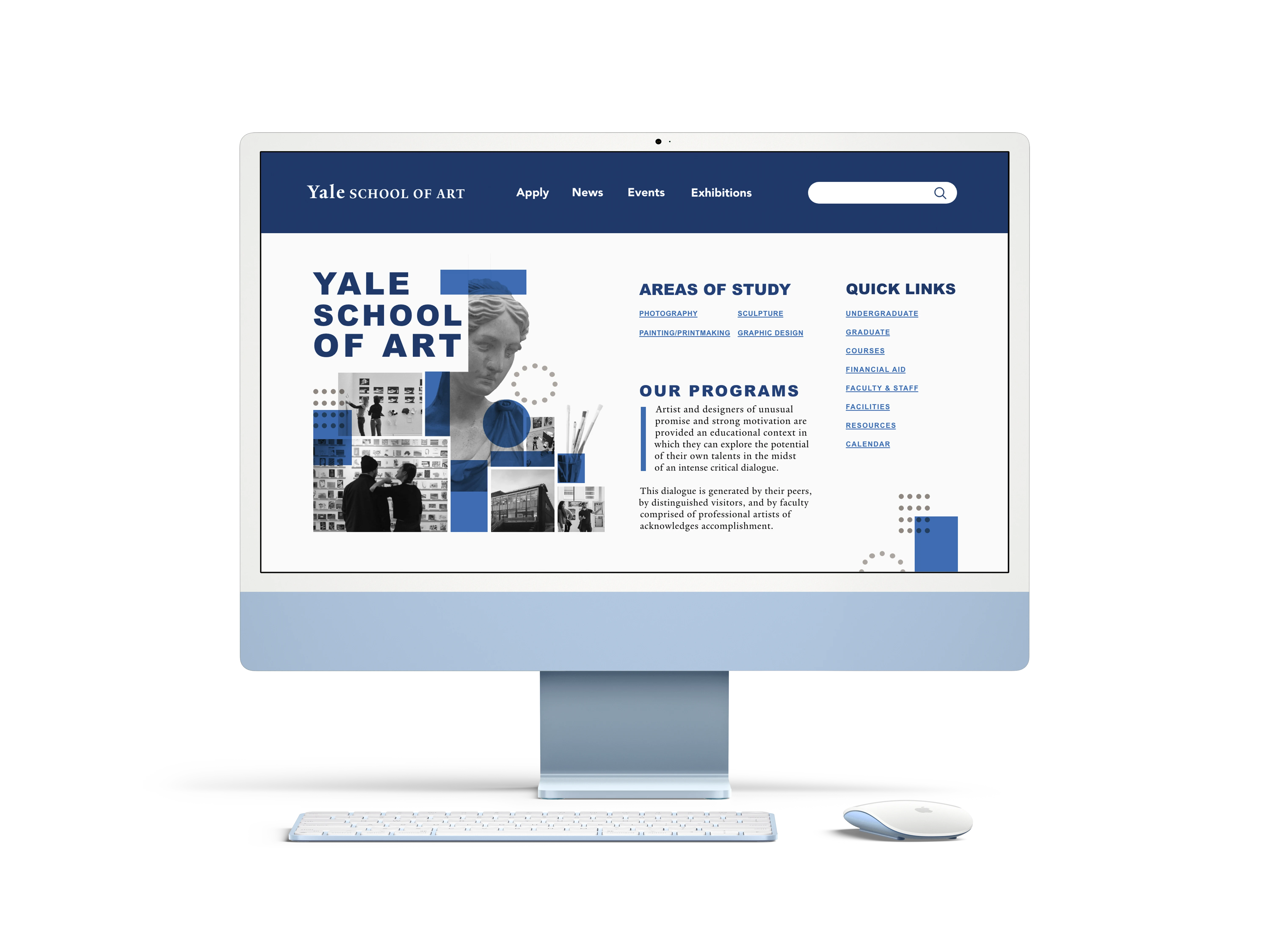
Redesigned the Yale School of Art homepage for improved usability and navigation. The new UI offers a clean, visually appealing layout, making it easier for students to access program information seamlessly

Original Issues

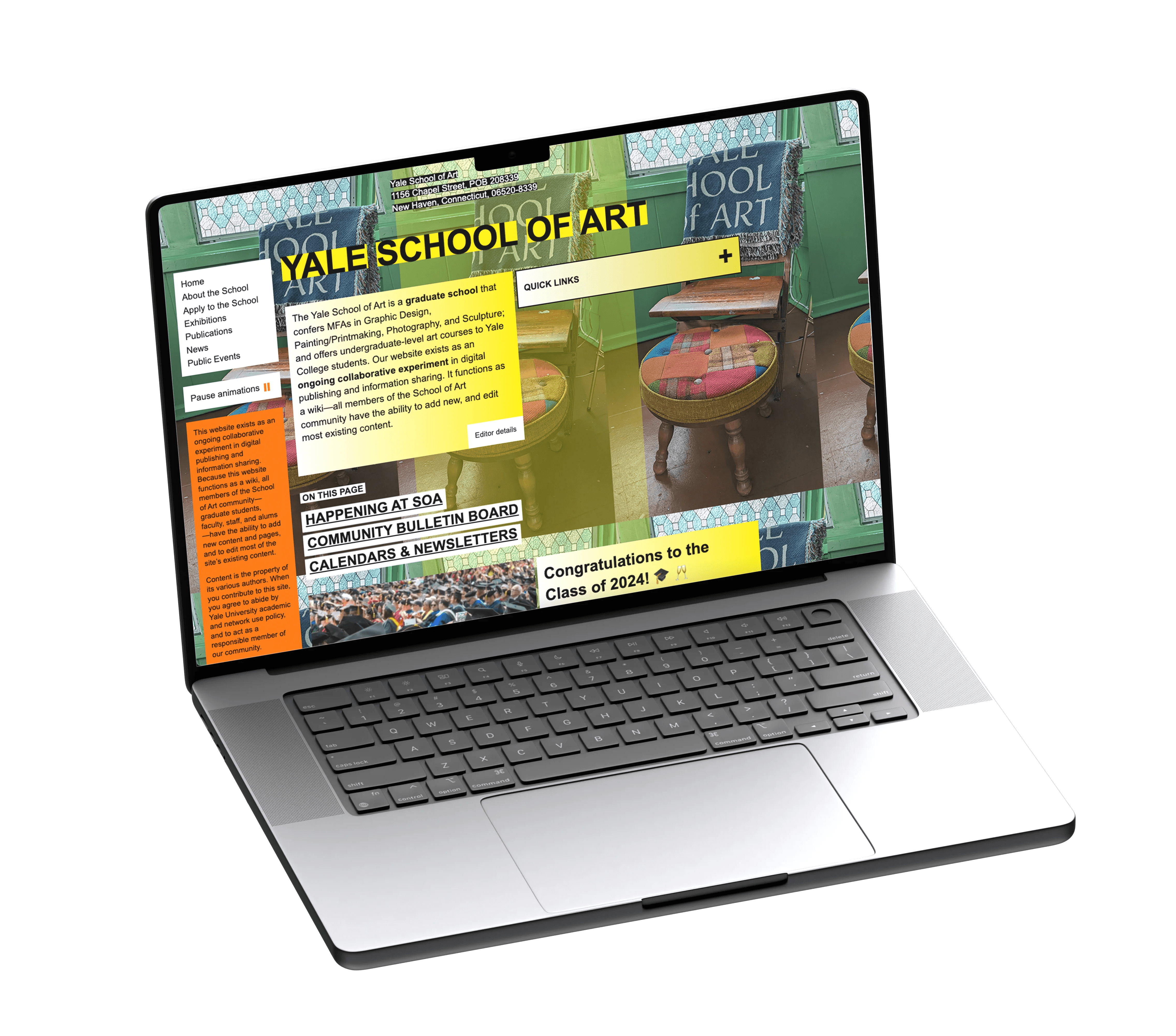
The current homepage of the Yale School of Art presents several significant problems in terms of user interface (UI) and accessibility, which hinder the overall user experience and the ease of information gathering.
The visual identity and branding of the website are not aligned with the image of Yale University.
The website's navigation structure is cluttered and unintuitive, making it difficult for users to find essential information quickly.
There is a lack of clear hierarchy and prioritization of content, leading to a confusing user experience.


Original Issues
The current homepage of the Yale School of Art presents several significant problems in terms of user interface (UI) and accessibility, which hinder the overall user experience and the ease of information gathering.
The visual identity and branding of the website are not aligned with the image of Yale University.
The website's navigation structure is cluttered and unintuitive, making it difficult for users to find essential information quickly.
There is a lack of clear hierarchy and prioritization of content, leading to a confusing user experience.
Solutions
Solutions
To address the identified problems with the Yale School of Art's website, the following solutions are proposed:
Consistent Branding: Developing a cohesive visual identity that aligns with Yale University's brand guidelines. Implementing a unified color scheme, typography, and logo usage across all pages to enhance brand recognition and professionalism.
Modern Aesthetics: Updating the website's look and feel with a contemporary design that reflects the innovative spirit of the Yale School of Art. Using high-quality visuals, clean lines, and engaging multimedia elements to create a visually appealing and engaging site.
